Chapter 4:
Cool Colors & More
Adding A Cool Color
We must realize that even within the same race, and even on the same person's face, different areas are different colors. People are not just dipped in paint; we are not cartoon characters, for there is variety in each of us. So, what about the other pinks we can utilize on the same face? This is where the cool colors come in. The function of cool colors, in this case, is to gray down the intense pure colors used for skin tones, as I mentioned previously. We merely take the pink and add various amounts of blue.
BLUE!?!
Don't get upset because you thought I was supposed to mention, what I said the old masters used in their portrait paintings, "green." WRONG! Green comes later. Relax. Green is for depth effect --- for an optical illusion’s sake. Warm colors come forward and cool colors recede. Remember that. In this case, we add blue to pink simply to darken [well actually, to “gray down”] and not for any sort of depth effect. But, why not just add black to “darken/gray down” pink? You would not add black because, if it were added, you would wind up with mud and would not know why. And, here’s the reason. Remember that here we are saying that pink is a very light orange, consisting of yellow plus red. Add black to that mixture and you will get [(black + yellow) + red]. Yellow + black is not dark yellow. No! Yellow + black is green. So, now instead of dark pink, you would have green plus red, which is mud. Therefore, instead of adding black to darken pink, just add a dark cool color, blue. Problem solved. By the way, adding brown (burnt umber) to pink, works just fine, too, and it is one of my favorite flesh tone formulas. We will be using the pink/brown combination later on in this eBook. Stay tuned.
NOTE: I exclaimed, "pink plus blue" and not "yellow plus blue."
NOTE: Flesh color, here, in portrait painting, is made up of yellow and red. Yellow + red = orange, and blue is the complement of orange. Complements are used to “gray down” colors, and that is the main reason blue is used in this case; so try not to think of it as being added mainly for the purpose of darkening.
Like I said, elsewhere, maybe some artists are not analytically inclined, and that is why they come up with these "don'ts." "Don't use black because you will get mud and I don’t know why,” they say.
I say, “Just analyze it.”
“But,” you ask, “if yellow + black = green ruins the effect by turning everything to mud, then why doesn’t the same thing happen when yellow and blue are added?”
As I just explained in the last note, "I did not say to add 'yellow plus blue'." However, you ask a good question, anyway. And, as with many things, you will remember the answer better if you figure it out yourself. How? Again, just “analyze it.” You will be delighted when you discover the solution all by yourself.
All right! Don’t rack your brains or hurt your head over it. It is not life or death; for the solution is that there never was a problem in the first place. Mud is in the eye of the beholder. In other words, yes, using black is perfectly acceptable, and so too is using any other dark color. Let us, now, examine this color mixture some more.
There are at least two ways to think about this:
1.) You are not adding blue to yellow, no, for that indeed would be green. What you are really doing is adding blue to red and getting purple as a result. And, since purple is opposite yellow on the color wheel (meaning it is yellow’s complement), then a graying takes place.
That is, yellow becomes dull when a little bit of purple is added. And what is dull yellow? That’s correct, it is raw sienna.
[carmine + blue = purple] + yellow = raw sienna
Yellow and purple are complements, so, purple is graying down yellow, turning the combination into raw sienna.
Now, it is easy to see that as an alternative to mixing the three colors of yellow ochre, carmine and blue, or even mixing the two colors of pink and blue, that by the mere task of analyzing, you can see that the same result is achieved by mixing yellow plus any dark color plus carmine.
Why?
Again, the answer is because dark yellow (or more correctly, dull yellow) is raw sienna. And, while I am at it, and in case you are wondering, raw umber is even duller yellow, and burnt sienna and burnt umber are dull and duller red-orange, respectively.
Raw sienna = yellow + brown
Raw umber = yellow + dark brown
Burnt sienna = red-orange + brown
Burnt umber = red-orange + dark brown
Now, you can begin to see why different artists use different pastels for flesh colors. When you analyze it, you readily see that there is “more than one way to skin a cat,” that there are several ways to achieve the same result. So, for extra measure, for backup and to cover yourself, you can add some light shades of raw sienna (Raw Sienna 234) to your basic dozen. And, while you are at it add some shades of gold ochre (Gold Ochre 231) since it more or less looks similar to raw sienna and because it is also in the yellow family and because they are close enough to each other on the color wheel.
To further clarify what results when you mix these three colors in two similar combinations, here they are together:
Pink Flesh (light raw sienna) = carmine + blue + light yellow
Add more red to the mix and you get:
Warmer Pink Flesh = carmine + raw sienna
No! I did not forget. I said, above, that there are at least two ways to think about this. I just gave you one way, and here, very briefly, is another:
2.) Using these same three colors of yellow, blue and red, let us analyze what happens if you think of blue as being added to yellow this time, instead of being added to red as before.
Yellow + blue = green
Add red to mix and you get:
Green + red = brown
Add a great deal more yellow and you get yellow-brown. And, as we concluded in the last analysis:
Yellow-brown = raw sienna
Need I say more?
Either way (method 1 or method 2), you get the same results and can alter the proportions of carmine and raw sienna to suit the situation. For example, when painting a portrait where you depict the overall skin color as having more raw sienna than carmine, then you are rendering someone as if that person has a somewhat darker “olive” complexion.
Enough of analyzing “the blue factor” for now, and on to the function of the other cool bright color, green, and its relationship to pink. However, before we do, let me expound about this mysterious ...
Graying Down Concept
When I say, “gray,” “warm gray” or “cool gray,” I am talking about the black and white gray everybody knows and loves, which may or may not be modified with the addition of warm and cool colors to alter its “flavor.”
Besides this everyday gray, colorists have come up with what they call, “artists gray.” This is an equal mixture of the three primary colors. It does not look like the black and white gray, but rather more like an undefined blah “no color,” closer to gray-brown than anything else.
Now, on to ...
Green And Its Relationship To Pink
Pink plus green is used for areas of the face that recede. For example, imagine your model looking directly at you. You will note that the nose juts out from the face with the tip being closest to you. Now, you can discern that the parts that connect to the cheek area are the parts of the nose that are farthest away from you, and are therefore receding. It is in those areas that you use a touch of green for the optical illusion depth effect.
That takes care of the pink areas, but how about the orange areas? What is an artist to do? I know! How about adding, hmmmm … orange? In those areas, the formula is pink + green + orange. Simple. As you can see, here is a good example of colors adding up fast. Since pink is carmine + yellow ochre (or any other yellow), then the orange areas would force you to mix four colors (carmine, yellow ochre, green & orange), which may get you into trouble. However, if you already have light oxide red as your pink, then, you are back down to the safe three colors. WHEW! That was a close one.
NOTE: You can use more than three colors in painting each area in a portrait; you can even use dozens and dozens of colors. However, you have to use a very light touch, don't blend with your finger, and take hours, days and weeks to finish your portrait painting. This is if you are using standard medium pastels, only, and using standard pastel papers. Be aware that altering either of these allows for other options. For example, if you paint on velour paper, or even on watercolor board, instead of on pastel paper, then you can use more than three colors in each area of the painting. Likewise, if you use hard, overlaid with medium soft, overlaid with very soft pastel paints, then you can also use more than three.
Dark Complexions
All the above formulas (and modifications we will be demonstrating in this eBook) were devised for painting portraits of white people, however, they work well with light skinned black people, too. Now all we need are formulas for the dark skin variety. These formulas can likewise be used for the shadow areas of white people. We go back to the same old song...
Flesh Colors = two warms + a cool
Since white people are not really white, but pink or orange, and Black people are not really black, but various shades of brown, then we need formulas for brown since we already have them for the pink and orange flesh color shades. Brown can be obtained by any number of color combinations, besides the mud brown (brown = red + green) already discussed, such as:
Brown = orange + black
Brown = orange + burnt sienna
Brown = orange + purple
Brown = orange + blue
Brown = orange + gray
HEY!?!
Is there a pattern going on here? Yes, for the most part, brown is any dark color plus orange (or even any dark color plus red and some yellow for that matter). I used to use black plus orange, but, black gets messy (can I hear the purists taunting me?), and you constantly have to clean your hands. And, if you are not too careful, you can look like a coal miner after awhile. Not only that, but if you use an economical (that is, a "cheap") black manufactured by a no-name company, then, the result can look very "chalky." Not good. To avoid that, I suggest you mix what I call, "pretty black" or "rich black." To do that just combine (in this order), green then red then blue, and leave it alone. If you desire, you can fiddle a little bit and throw in a couple of dark colors, brown and yes, even black, itself. But, as you can see, by doing that, the number of colors adds up rather rapidly. So, just stick with the three. For economy's sake, you can achieve a pretty black by mixing only two colors of red and green, and omitting the third color, blue. Specifically, I suggest you mix using red violet light 546.3 and olive green 620.3.
Using your favorite two warm color brown formula (mine, now, is burnt sienna + orange), then what's left is to add a cool color to gray it down, either blue or green. If burnt sienna were not part of this formula, then simply adding green would result in a so-called olive skin tone complexion, similar to the raw sienna/carmine mixture discussed earlier. Likewise, the addition of blue would result in dark browns, typical of dark-skinned Black people. However, since burnt sienna is included here, then the cool color green works just fine, here, just as it does in fair-skinned white people.
An Important Tip: As an aside, I will add that you can also get any shade of brown by mixing raw umber plus ANY other color except maybe green. Especially useful in painting shades of browns of various races of people, is the mixing of raw umber plus either bright yellow or bright orange or bright red or bright blue. This is another amazing discovery. I keep having these "happy accidents" and finding out things like this, as you probably have had, yourself, and will continue to have, too.
As another aside, just as pink is already manufactured as the lightest few shades of "Light Oxide Red" pastel sticks, I found that the black + orange = brown formula is likewise already manufactured as the darkest "Permanent Red Light" pastel stick, “Permanent Red Light 370.3.” I use this as my all-purpose medium brown (since it is two colors in one), and only mix burnt sienna plus orange when I run out of dark permanent red light.
This good news gets even better, for a very similar two color combination mixture of Brown + Green for dark complexions is already being manufactured as "Cuput Martuum Red 343.3." So, add it to your basic dozen. In the meantime, you can continue to experiment by mixing brown/green, or brown/blue color combinations to come up with variations of it. For example, when you do, you will discover that you can also get a very, very similar color by mixing raw umber 408.3 plus mars violet 538.7. Dark blue-purple (mars violet) looks very similar to the ultramarine blue found in oil colors. My favorite brown alternative of mixing the three colors of burnt sienna, orange and green is of mixing the two colors carmine 318 and mars violet 538, which is a red plus a dark color. And, in case you are wondering if not only can you get brown by mixing orange and a dark color, but you can also do so by mixing red and a dark color, as evidenced here, then think again. For reds only work if they are actually pure reds with some yellow mixed in, which by definition, puts them in the orange family.
To get lighter shades of brown, use lighter pastels sticks (or add white in a pinch), and to get darker shades of brown, add burnt umber (which is also a brown, itself).
Just as the color pink is used often in painting portraits of White people, and the formula, brown + green is used for the overall skin color of dark skinned Black people, likewise a very dark violet (violet is blue-purple) is also used a great deal in shadow flesh mixtures of dark skinned Black people. So, add Violet 536.3 to your basic dozen. Alternatively, you can mix it yourself by blending the colors you already have, Red Violet Light 546.5 + Mars Violet 538.3, or by blending any other red + blue. Note, that this is shadow brown and not the pretty black just discussed.
I just mentioned that Brown + Green is being manufactured as Cuput Martuum Red 343.3, when in actuality it is a red-brown or purple-brown. However, in actual usage it looks so much like brown + green, that you can get away with it easily --- art, not science, sisters and brothers.
Other Needed Colors
Now, almost all that's left to depict any complexion of any race is to have on hand various shades of warm grays. Beware of purists who scream never to use gray. I say that gray is perfectly fine as long as you use the right value and as long as you add a warm or a cool color to it. Again, pastel manufacturers have this covered, too, for not only can you buy warm grays, but you can buy cool grays, also.
If you choose not to buy any more pastel sticks, you can make warm grays by mixing black and white (look out purists) plus yellow ochre. If you already have a set of plain grays, you are fortunate. In that case, just mix any desired shade with yellow ochre. If you are daring, confident and bold, you can substitute orange for yellow ochre, but be careful, for you can get things real muddy (non-desired shades of brown) very quickly. In other words, just stick with yellow, to mix with shades of gray, in order to create warm grays.
Finally, you have the cool grays, bluish grey 727, which are mostly used in the light areas of the face, and the other cool grays, green grey 709. These are the grays which are used to “gray down” colors and to make parts of your painting appear to recede.
Another Optional Pastel: Although totally unnecessary, it is highly recommended that you have at your disposal, a special kind of Conte’ Crayons, called “sanguine” pastel sticks. Get medium sanguine. This sanguine crayon is a burnt sienna type color that comes in handy in all sorts of unexpected ways.
Are You Thoroughly Overwhelmed Yet?
Never fear; in the beginning, and to keep it simple for you, just think to yourself that ALL flesh tones are basically composed of a sensible brown color plus some sensible warm color plus a sensible cool color. For example, in Black flesh, (or even some Native American Indian flesh) the formula includes brown + burnt sienna. In White flesh, the formula includes brown + pink, and for other races (Asian, Hispanic and more) the formula includes brown + yellow orchre. With each of these formulas, do not forget to add an appropriate and well-defined sensible cool color. In chart form, it looks like this; let's take a look:
======================================================
Black Skin Flesh Tones (brown + burnt sienna) for the base colors. Carmine + mars violet give similar results, as indicated, above. This knowledge is useful and very convenient since, as will be seen below, mars violet is also used extensively for shadow tones and neutral tones, too. However, since flesh colors = two warms + a cool, then we need a cool color for the flesh tone. As I mentioned elsewhere, I use the cool color the old masters favored in their flesh tones when they painted people, and that is the color green. So, even though you can still use brown + burnt sienna as your base colors (or even use carmine + mars violet), recall that since brown is really dark orange, then you can just say your base colors are orange + burnt sienna. And when you include the addition of a cool color, then more specifically, the base colors plus a cool color become orange + burnt sienna + green. Re-arranging the color order we have burnt sienna + orange + green. When we re-arrange the color order like that, do you notice anything? We now have burnt sienna plus what? We now have burnt sienna plus orange & green. And orange & green is...? That is right! It is our old friend brown again, taking us back where we started at the top of this paragraph with Black skin flesh tones = brown + burnt sienna. As I say over and over again, "analyze it" my friends.
Oops! I am getting away from "keeping it simple" by elaborating and not leaving alone the simple mixture of brown + some sensible warm color. Anyway, you may see more about this in any videos I may produce.
a.) light flesh tone
b.) medium flesh tone
c.) dark flesh tone
Other Peoples Of Color Skin Flesh Tones (brown + yellow ochre) for the base colors
a.) light flesh tone
b.) medium flesh tone
c.) dark flesh tone
White Skin Flesh Tones (brown + pink) for the base colors. I am keeping it simple by merely saying brown + pink, but of course you figured out that it is really light brown + pink. As I just mentioned in my discussion about the flesh tones of Black people, brown = orange + a dark color of your choice. Here also, you need the addition of a cool color. I have shown you that the old masters used a little bit of red plus a whole lot of yellow for their White people orange. You can add so much yellow (light yellow, that is) that the orange color can look rather pink. This is good, in that since White people are either orange or pink anyway, you can adjust accordingly. So, you can easily get away with White flesh tone being either brown + pink -- that is, tending towards orange -- or just pink by itself. Now, what about the needed cool color? Whereas, I use green as the cool color for Black people, for White people, on the other hand, I use... well... green. If it ain't broke, don't fix it. That is, the old masters used green, so, why tinker with success? That being said, you can still get away with using blue, as mentioned at the top of this webpage under the heading BLUE!?! because you will be using it to darken the color pink. That being the case, then the flesh tone base colors are either light brown + pink + green, or just pink + blue. Likewise, as I suggested regarding Black people, you may see more about this in any videos I may produce.
a.) light flesh tone
b.) medium flesh tone
c.) dark flesh tone
Shadow Tones (raw umber + mars violet )
a.) light shadow
b.) medium shadow
c.) dark shadow
Neutral Tones (green-gray + mars violet)
a.) light Neutral tone
b.) medium Neutral tone
Additional Skin Tones
light orange tone (light burnt umber + gold)
(Gold is needed to prevent the painting from looking too chalky)
medium orange tone (burnt sienna)
dark orange tone (burnt umber)
Hair Color
Deep Yellow 202.9
Burnt Umber 409.3
Cobalt Blue 512.9
Permanent Green Light 618.3
Bluish Gray 727.5
a.) light gold
b.) dark gold
a.) light lavender (purple)
b.) dark lavender (purple)
a.) light orange
b.) dark orange
a.) light brown
b.) dark brown
Black & White.
Miscellaneous Colors for clothing, accessories and whatnot are the primary & secondary colors.
In the chart above, I mention light, medium & dark flesh tones for the various races of people. To be more specific, I mean light, medium & dark pastel colors to select from; for example, in the simple white skin tone formula of "brown + pink," use light, medium & dark brown for the three shades.
These skin tone color formulas for different races of people are suggested starting points for any portrait. Likewise for the shadow colors and so forth. That is, in each portrait you paint, you must take other things into consideration. For example, is the subject you are painting outdoors or indoors? If it is outside, is the sky sunny or overcast? Is the time morning, noon or night? Is the season Autumn, Winter, Spring or Summer? Is the overall lighting warm or cool, bright or dull? And there are many other factors to consider besides these. For instance, will the painting be high key or low key?
For these reasons and more, the skin tone formulas for the flesh colors given in this eBook are in general terms and not too specific. I am giving enough for you to get started, for as I said elsewhere, I wish I had known this when I was in high school.
I did, however, show you what you need to do in different circumstances. For example, you will read in the next chapter that you should separate the face, for instance, into light, medium and dark areas, and when you do, you should never mix the chosen colors of one area with the look-alike version another area of the face. And because the light, medium and dark colors can vary, depending on the various factors just discussed, I cannot specifically say things like "always use Permanent Red Light 370.3 for your brown." I said, mix brown and burnt sienna or brown and pink or brown and yellow orche for the basic formulas for different races of people, for example. I told you what the various browns and burnt siennas and pinks and yellow orchers were, so, all you had to do was to experiment on a practice sheet before you committed yourself to the color on the actual painting. I have even supplied a surplus of hints and tips. For example, I said, when in doubt, just select the correct shade of grey and substitute that for the unknown color you are seeking.
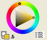
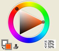
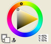
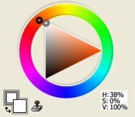
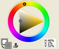
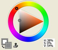
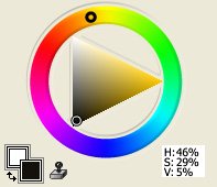
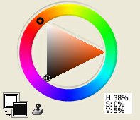
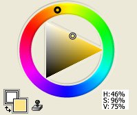
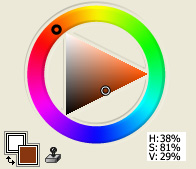
Towards that end, I will end this chapter by giving you some visuals using a digital color wheel, so that you can have some idea where flesh colors are located on it. That way, you will be able to see in your mind's eye where the colors are and can choose which ones you want to use at any given time.
These are very handy diagrams because all pastel colors are either in their pure state or they are mixed with black or white, anyway.
Actually, all the pastel colors I have given in my eBook can be found on this digital color wheel. Realize that all pastel color names were arbitrarily given by the manufacturers. So, just think which flesh color you need on the digital color wheel, and who cares what the real name is.
In these pages I have said that people are basically orange - sometimes leaning towards yellow, and sometimes leaning towards red. So, for this demonstration, I am picking both Yellow-Orange and Red-Orange to showcase, since they represent typical flesh colors for white skin and for the skin of generic peoples of color, and modifying them so you can see what visually happens. And in case you are wondering, with this digital color wheel, I would use pure orange alone plus either gray or black if I wanted to demonstrate the various shades needed for Black skin.
Since flesh colors are two warms + gray + a sensible cool color, I am omitting the cool color here. The two warm colors I am using are yellow and orange for one instance, and red and orange for the other.
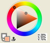
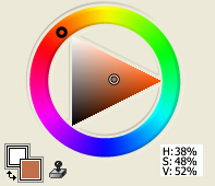
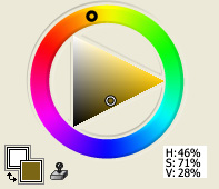
In all the diagrams, there is a color wheel of colors surrounding a triangle with the pure color on the right tip of the triangle, with pure white on the top left tip, and with pure black on the bottom left tip. The remaining colors in between are all shades of gray mixed with the pure color.
The small image on the bottom left of each diagram is the final color when the color selection on the color wheel is combined with the color selection in the triangle.
Diagram 1:
Pure Yellow-Orange |
Diagram 1:
Pure Red-Orange |
Diagram 2:
White from Yellow-Orange |
Diagram 2:
White from Red-Orange |
Diagram 3:
Gray from Yellow-Orange |
Diagram 3:
Gray from Red-Orange |
Diagram 4:
Black from Yellow-Orange |
Diagram 4:
Black from Red-Orange |
Diagram 5:
Yellow-Orange mixed with White |
Diagram 5:
Red-Orange mixed with White |
Diagram 6:
Yellow-Orange mixed with Gray |
Diagram 6:
Red-Orange mixed with Gray |
Diagram 7:
Yellow-Orange mixed with Black |
Diagram 7:
Red-Orange mixed with Black |
Notice the green tinges in the Yellow-Orange flesh colors clearly depicted in diagrams 6 & 7. That touch of green is because yellow + black = green. The flesh colors do not look greener because of the orange factor.
Now that you can visually see what is happening on the digital color wheel, you can have confidence in your color choices of flesh tones or any other color.
I must say, though, that some industrious soul actually took the time to put together a somewhat comprehensive selection of skin tones from many of the races of people all over the world and placed them online. They even went so far as to include color swatches, thereby making it very easy for you to match your pastel colors with their supplied swatches. For that amazing resource, just click on this
ethnic fleshtones link
and you will be directed straight to that fascinating and powerful resource.
If there is still something that I missed, then enlighten me through my "Contact Us" page.
last installment: Chapter 5: Final Thoughts
Enjoy this page? Please pay it forward. Here's how...
Would you prefer to share this page with others by linking to it?
- Click on the HTML link code below.
- Copy and paste it, adding a note of your own, into your blog, a Web page, forums, a blog comment,
your Facebook account, or anywhere that someone would find this page valuable.