


|
How To Draw and Paint Drawgirl
|
 |
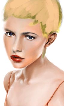 |
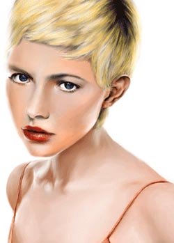
After having explained that painting green in the model's hair in the previous step was no fiasco, we now answer the question I posed as to what light color the pastellist used for the next layer in the burnishing process. But before I answer that, this is a good time to stop and compare this artist's technique of painting hair to mine. Whereas this artist creates hair by burnishing, I, on the other hand, utilize a different method. Instead of alternating light and dark layers, I alternate light and dark patches. That is, I lay a short piece of a dark pastel stick on its side and paint a tiny swath with it, then I lay a short piece of a light pastel stick on its side and do likewise, resulting in light and dark checker board style patches. Sometimes I can get away with omitting the light color patch. Then I ever so lightly and every so gently "comb the hair" (as TV artist Helen Van Wyk calls it) with my pinky. In no time at all, almost instantly, hair is realistically rendered.
This "checker board" patchwork style is what I noticed comic book artists used when I was a child growing up during the "Golden Age or Silver Age of Comic Books" in the 1950's & 1960's. Specifically, I marvelled (we will get to Marvel Comics in a second) at the exquisite work done by at least one artist for DC Comics as he drew individuals and other super hero comic stable of characters. At the time, I did not know his name for in those days artists generally were not given credit. However, from doing my own research, I believe the Superman artist I liked the best was either Curt Swan or Wayne Boring (the Superman artist for the 1950s), I'm not sure which. Two more artists at the time were Al Plastino and Kurt Schaffenberger.
Anyway, DC Comics has released some old comic book archives which showcase a great many of these works. There are so many re-releases it is hard for me to recommend only one for you. But, if I had to choose, I would select Superman in the Sixties. If you wanted more than one, then I would also recommend both Supeman in the Seventies and Superman in the Fifties. Other good ones include Superman: The Action Comics - Archives Vol. 1-4 series, World's Finest Comics Archives Vol. 1-4 series, Superman: Man of Tomorrow Archives Vol. 1-2 and more.
Since I had become an adult, I had long since stopped buying comic books by the seventies. However, I did used to peek at the comic book shelves at regular grocery stores. I do not see that happening today, for now you have to deliberately go to a comic book store. As I was saying, the last time I took a peek was around 1971 where I spied one which caused me to do a double-take. It was an issue where Lois Lane became a Black woman for one day and she feared Superman would not love her because of it. Being a Black man, myself, that issue really caught my attention ("do a double-take," like I said). Still, I did not buy it or even read it at the store, for I felt ashamed at being a grown man reading comic books in public. You can find that story and good artwork in the previously mentioned Supeman in the Seventies.
Today, when you buy comic books, you do not have to do research in order to find the name of the artist you like, for everybody connected with it is listed in the credits. I used to admire how my favorite talented DC Comics artists, Curt Swan and Wayne Boring, would render hair so eloquently and simply of their characters such as Superman, Lois Lane, Wonder Woman and the rest of the casts in the various stories. The hair was merely checker board black & blue... black for the dark color and powder blue for the light color. At quick glances the hair looked so real, but studying them I saw that they were just checker board black & blue. This is contrasted to the Marvel Comics characters such as Spiderman and so forth.
My brothers & I never, ever, bought any Marvel comics (after we discovered them in the 1960's) for we thought them to be so inferior as to only cause us to scan their pages while shopping for quality DC Comics action hero productions. For us, there was DC Comics and then there was everbody else. To us, DC Comics was that superior as far as Super heros go. Otherwise, it was Disney Comics. I mention that because here it is decades later and Spiderman and company are on practically an equal footing as Superman and Batman. What a difference a few decades make.
Even though my favorite Superman illustrators were Curt Swan and Wayne Boring, the most decorated, famous & popular Superman artist is the reigning champion, the prolific Alex Ross, who actively pumps out quality work after quality work. At least during the time period I am writing this tutorial (Christmas holidays, 2005) he is still illustrating. He is probably so admired because he does his superhero artwork as if they were oil paintings instead of regular comic book renderings. He draws/paints for DC Comics as well as for Marvel Comics. You can see samples of his work with both publishers in the graphic novel Kingdom Come featuring Superman & company from DC Comics and the graphic novel Earth X featuring Spiderman & Company from Marvel Comics. To me, Kingdom Come has the better artwork of the two graphic novels. By the way, they are called "graphic novels" because the stories are written as if they were novels and they are illustrated as if they were comic books. Even so, as good as Alex Ross is, I still prefer the Andrew Loomis influenced artwork of both Curt Swan and Wayne Boring. That is, they draw as if they studied figure drawing from Andrew Loomis, an illustrator I mention time and time again on this, my pastel portrait secrets website.
You can easily find all of the books mentioned on this page at my pastel portrait secrets
art store
.
Now to answer the question of the moment, what light color does the artist of Drawgirl use in this step of burnishing the model's hair? The answer is that the pastellist covers the so-called "green" with Rembrandt soft pastel color - yellow ochre 227.5.
Your coloring process continues still in... Step 60.
![]()
![]()
![]()
![]()
![]()
Go To Step 60
Return to Drawgirl Tutorial Home Page
Return to Home Page
